Notes on the origins of painted letters
A traditional practice in a design led world
*
Sign writing today is proud tradition thriving once again in the future tense. There are few paths of creative practice that allow such wholesome reward and such enormous sense of achievement over the short to medium term. It is a practice that is no longer based on the 5 year apprenticeship of the past. It is a rejuvenated craft that is being shared and passed on freely – the reluctance and bias of the past task masters is gone. Not to say it’s is without its challenges, at a stroke it might be the best job in the world and in a wag of a brush, probably the worst – ask any pro-writer. But inexplicably it is an incredibly satisfying act, to create letters as semiotics which are after all magical by nature.
Because of a fundamental simplicity of brush and paint, yet intricate mix of working parts, it is a pathway undertaken only by those with the most ardent passion, the fire, and the heart. As any professional sign writer will tell you there is no greater or more complex, broad and wide design field than signwriting.
Understanding sign painting is to acknowledge its origins and pre history found in our cultural mark making languages. Sign Painting is art, the earliest forms of signage were indeed pictorial just as the earliest pictures were likely to have served as signs.
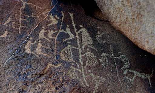
An ancient Aboriginal rock carving is seen in this photo taken on the Burrup Peninsula in the north of Western Australia. Australian Aboriginal nations, created the earliest examples of useful, social networking symbolism.
Long before written ‘alphabet’ languages were developed, land, cave, body tattoo and rock art were the predominant cultural ‘signage’.
*
When. Where
One of the most difficult decisions in talking about the history of any aspect of more recognisable forms of signwriting, is to decide when it started.
How about Pompeii, AD79?

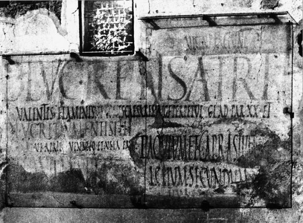
The walls of the houses and apartment insulate in the Italian city of Pompeii (and the other cities lying at the hinge between the Roman Republic and the Empire) created the original form of signwriting —right down to the use of the flat brush.
Writing on walls with charcoal and inscribing with brushes, stones and knives was a common aspect of Roman life. A recent study, authored by researcher Eeva-Maria Viitanen, an archaeologist at the University of Helsinki, concentrated on political messages.
It was through political messaging that the revolutionary, information-wants-to-be-free promise of Roman disruptive technology (known as “graffiti”) hit the wall.
Much of the political advertisement of the time was commissioned by the candidates themselves and their supporters. They often hired professional painters to create the spots and competed against others for prime space. That space tended to be the sides of upper-income houses, not bars and shops.
“The current view is that any candidate could have chosen any location and have their ad painted on the wall. After looking at the contexts, this would not seem very likely,” Viitanen told the publication LiveScience. “The facades of the private houses and even the streetwalks in front of them were controlled and maintained by the owner of the house, and in that respect, the idea that the wall space could be appropriated by anyone who wanted to do it seems unlikely.”

The idea of geometrically rationalizing ancient Roman inscriptions became something of a pastime with Renaissance scholars. Felice Feliciano, Fra Luca de Pacioli, Geoffroy Tory, even Albrecht Dürer published treatises on the subject, and the idea has been pursued, with varying amounts of success, by artists and typographers ever since.
David Lance Goines interest in the subject began in 1967 after studying Dürer’s classic On the Just Shaping of Letters,4 and, as he later stated, “fun led to obsession.” He spent 1968–1969 in London, where he studied under the legendary Alfred Fairbank, and “devoted an unreasonable amount of time…to the pursuit of this bizarre subject.” He compiled this early work into a draft manuscript, A New Abecedarium, but was ultimately unsatisfied with his approach and the book was never published.
The following passage was written by W. R. Lethaby, founder of the Central School of Arts and Crafts, in his editor’s introduction to Edward Johnston’s writing manual of 1906:
‘The Roman characters which are our letters today, although their earlier forms have only come down to us cut in stone, must have been formed by incessant practice with a flat, stiff brush, or some such tool. This disposition of the thicks and thins, and the exact shape of the curves, must have been settled by an instrument used rapidly; I suppose, indeed, that most of the great monumental inscriptions were designed in situ by a master writer, and only cut in by the mason, the cutting being merely a fixing, as it were, of the writing’.
Nobody had ever said this before. Now it is accepted without question.
For many centuries, the leading authorities on the subject of Roman letters were in agreement that the shape of written letters evolved from the stone inscriptions. They also maintained that the stone inscriptions were designed with hard-pointed tools. Both of these misconceptions were further dislodged in 1968 when Father Edward Catich published The Origin of the Serif, in which he argued that the stone inscriptions were designed by brush writing. No one before had even admitted this as a possibility; in fact, the eminent British authority Graily Hewitt had declared that the brush had nothing whatever to do with the development of the Roman alphabet. Nonetheless, Catich marshalled impressive graphical and paleographical evidence in support of his theory—then proved it by writing the letters with his brush and incising them in stone.
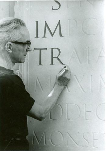
Ted Catich
Not long after Lethaby wrote, in 1914, brush lettering was discovered that had been painted on the walls of Pompeii in 79, when it was covered by the volcanic ash and preserved. Pompeii was a sophisticated and lively little town, and the publicity for the contested local elections was painted, mostly at night, by the light of lanterns or the moon, by brilliant signwriters, working sometimes in teams and sometimes alone, who signed their names. (Aemilius Celer was one of the loners, often working by moonlight)
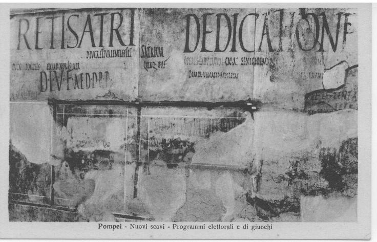
Among a great deal of excellent rapid writing in the style to which later palaeographers gave the name ‘rustic’ there is one piece in Roman capitals that link directly to the new style that was now beginning to be cut in stone:
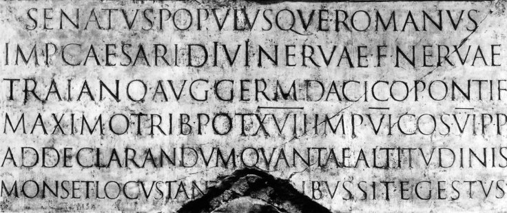
Above the Trajan Column panel with it’s stiff formal letters
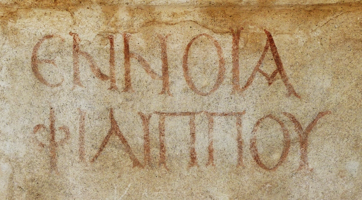
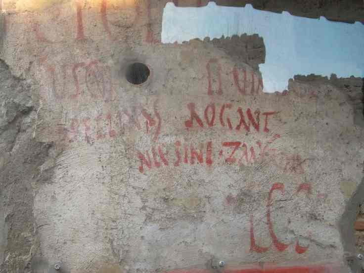
The proportions are not identical with those of the so-called ‘square capitals’, of which the lettering of the inscription at the base of Trajan’s Column has become known as the archetype. But there are other stone-cut inscriptions of which the drawing is no less masterly which are very closely related indeed yet imbuing a fresh, strokeplay, narrative. And Epaphroditus is one of these.

Above: The Epaphroditus panel
Original Roman forms
There is room here to compare letters, and to note how in the Pompeian example the right-hand stroke shows the angle of the laying-on of the brush, a slight swelling of the line as it descends, and a very slight curve too, and its rapid lifting away at the foot to make a serif – and to observe how closely the Epaphroditus letter catches this dynamic calligraphic movement.


Much of Roman epigraphy is dull stuff, turned out soundly enough as a matter of civic duty. Happily there are exceptions, inscriptions that are full of life and beautifully drawn and cut.
Original Jensen type
These narrative forms in turn inspired the antiquarii of the 15th century, like Felice Feliciano, who drew them and passed them on to their contemporaries. Their work is known to us from inscriptions on the buildings of the Italian Renaissance and printing types that were cut by Venetian punch cutters like Francesco Griffo who worked for Aldus.
The Epaphroditus inscription ranks with these inspirational models. It may lack the nervous refinement of the Trajan letter, but that example is increasingly inaccessible, having suffered from nearly two thousand years of weathering, and, as visitors to Rome are all too well aware, our view of it is now almost permanently obstructed by scaffolding and green plastic.
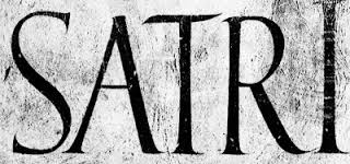

(To add to this dismal catalogue, it should be borne in mind that the two letters RI are all that remain at Pompeii of the SATRI inscription shown above, and they are faint and ghostly after nearly a century of exposure to sun and rain: all the rest of the plaster was blown from the wall by bombing in 1943.)
The brilliance of the Epaphroditus inscription offered us a direct link to the master writer who was its ordinator (writer and designer) and perhaps its sculptor (cutter) too. It deserves more care from those who are responsible for it, and we have some right to ask them to apply it, however belatedly.
Tradition in a design-led world – NGS